Branding · Concept project
Lin Estates
A print identity system for high-end private residential estates in Toronto
- Kind of work
- Branding
- Project
- Concept project
- Scope
- Real estate & finance · Branding · Print
- Year
- 2026
Lin Estates
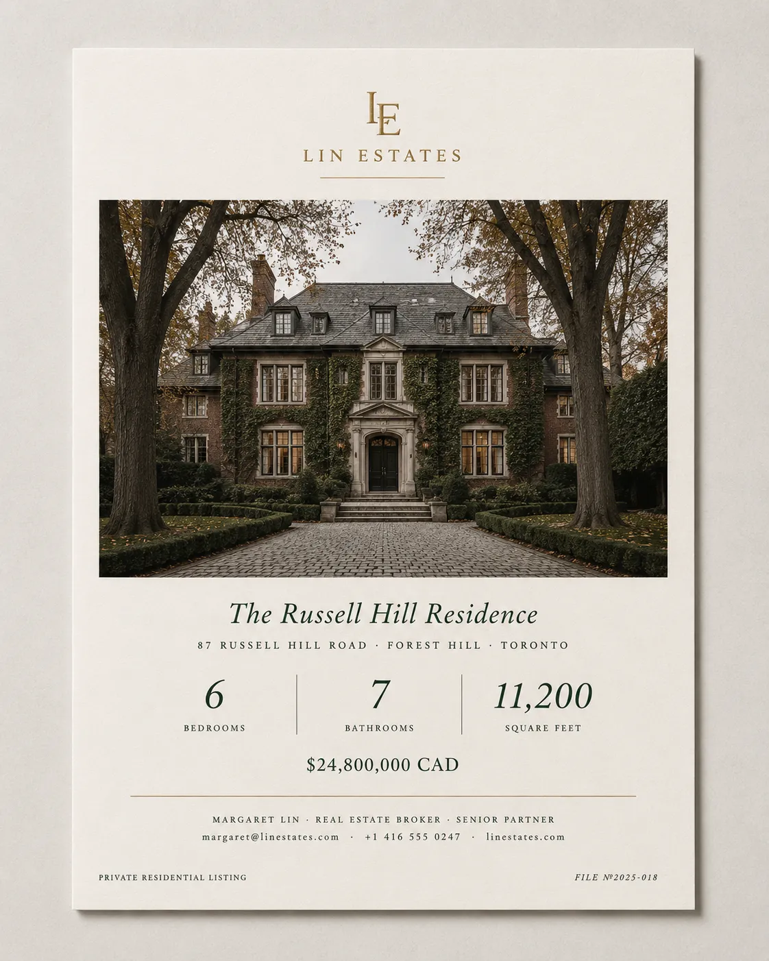
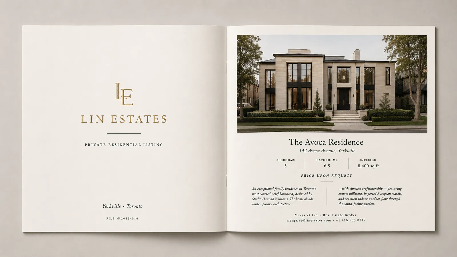
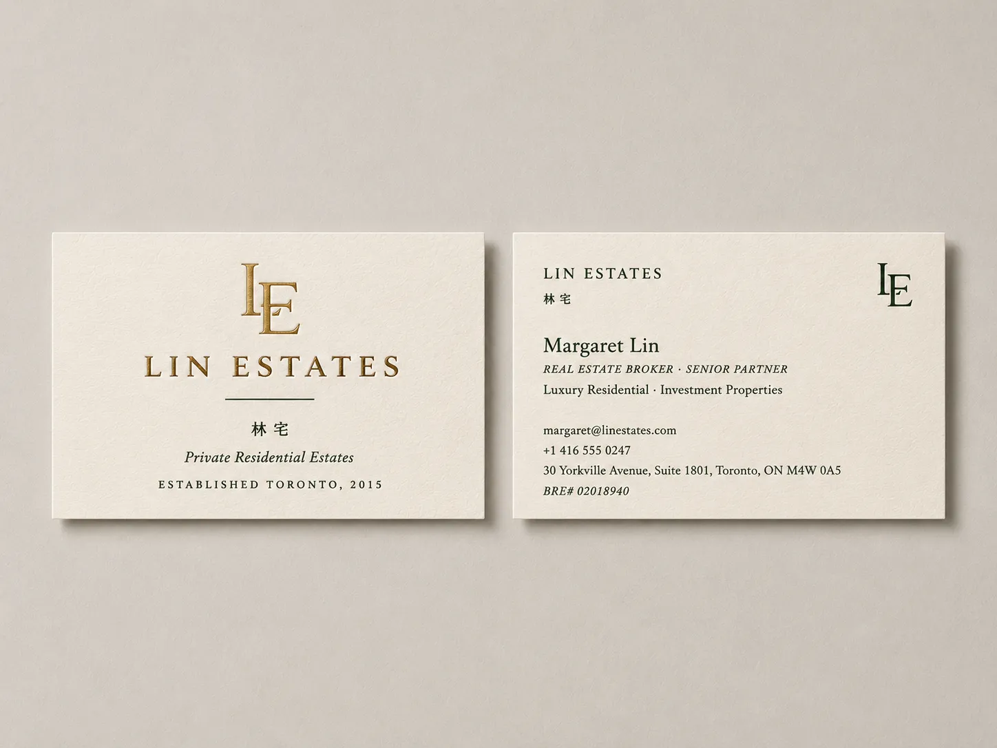
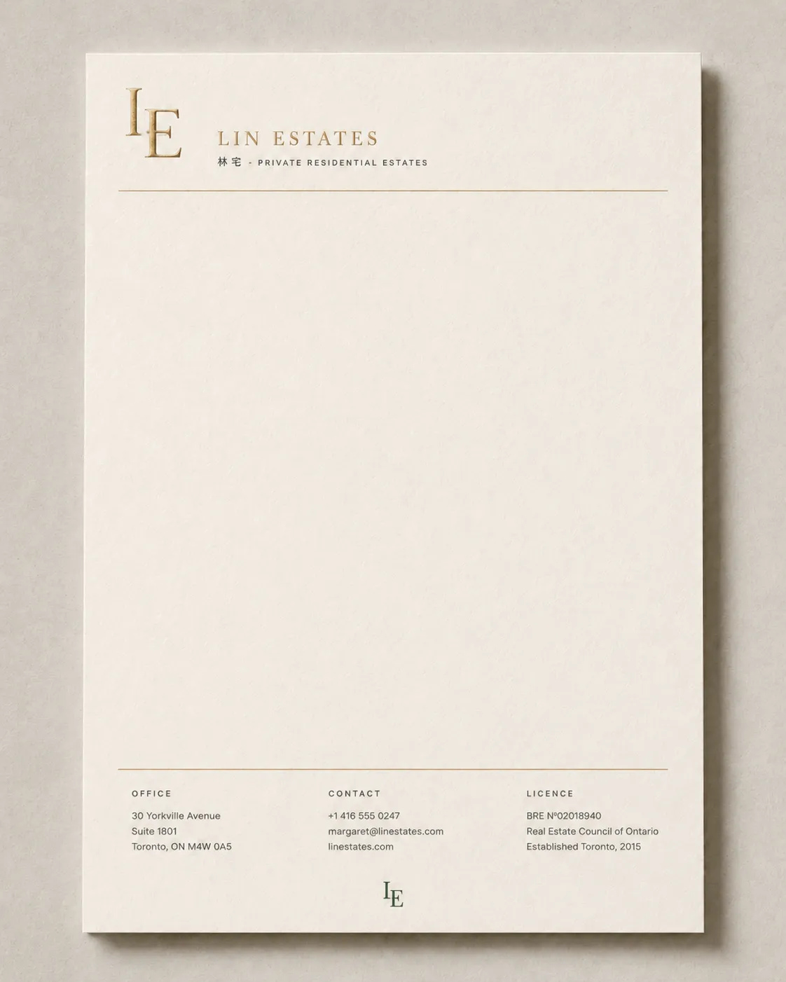
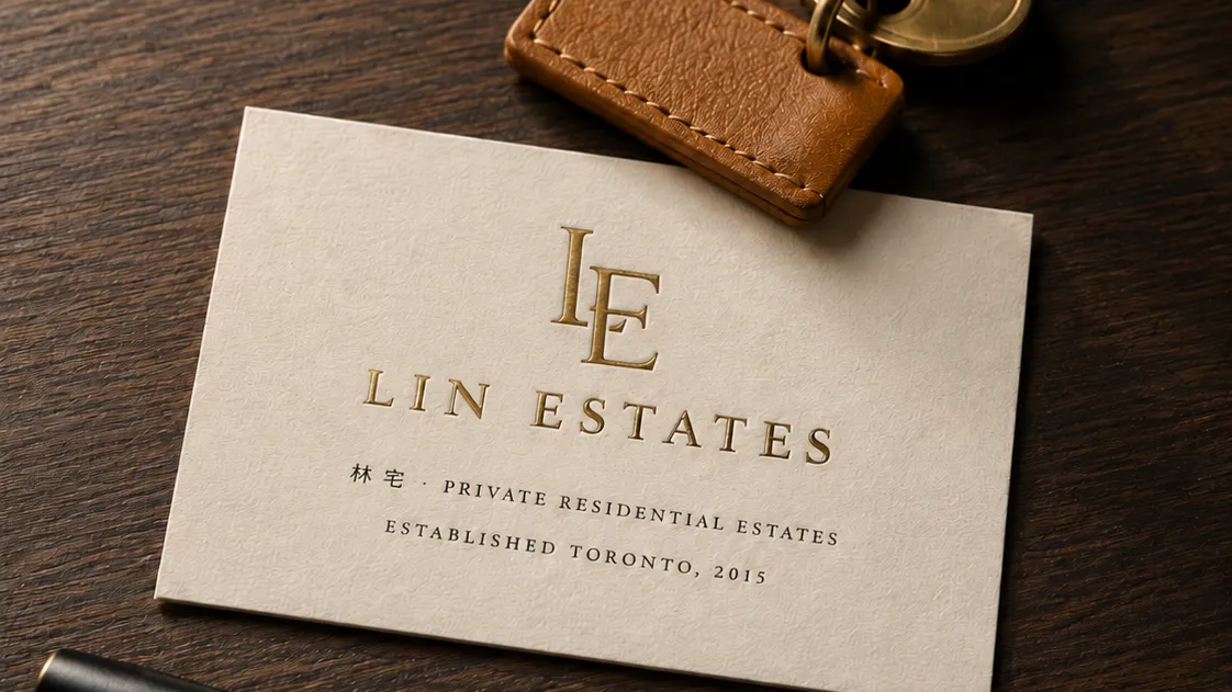
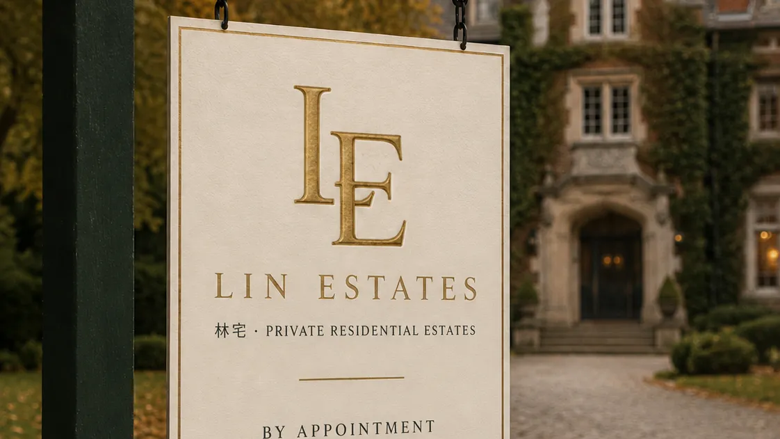
Lin Estates is a conceptual Toronto-based luxury residential brokerage identity. Built around an “LE” monogram and the Chinese reading “林宅 (Lin's Residence)”, the system spans an exterior listing plaque, listing sheets, property brochures, business cards, and letterhead.
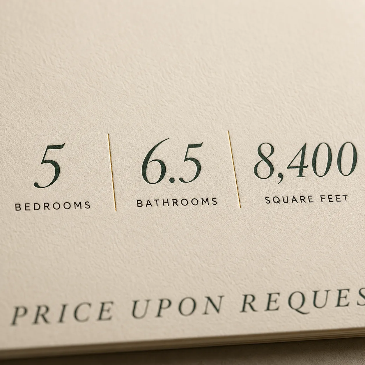
The signature is an “LE” monogram paired with a serif LIN ESTATES wordmark and the Chinese 林宅, communicating an inherited, generational quietness. The palette is limited to three: unbleached cream cotton stock as ground, deep forest green as primary (for body text and rules), warm gold foil as accent (reserved for the monogram) — gold here isn't decoration, it's the standard finish for luxury real estate print. Materials are tiered: the exterior plaque carries the moment of arrival, the listing sheet carries information density, the brochure carries restrained spread layouts, and the cards and letterhead carry the tactile detail. Every printed surface uses heavy cotton stock with foil and debossing, turning the brand mark into a tactile detail at every client touchpoint.
The system
Colour and type
Colour palette
- #f0ebe0
- #1f2e20
- #b89366
- #3a2a1e
Typography
- Trajan Prodisplay
- Source Han Seriftext
- Helvetica Now Texttext