Branding · Client project
He wanted ten. We made it five.
COEYS KINGDOM debut streetwear capsule — and why we subtracted first
- Kind of work
- Branding
- Project
- Client project
- Scope
- Clothing · Brand series design · Concept direction
- Year
- 2026
Coeys Kingdom
The client came to us wanting to drop ten prints at once. We told him to start with five.
The first move in building a brand isn’t filling the racks — it’s locking in a tone. Use the five most representative pieces to prove out what this brand feels like and looks like. Get the direction right and it doesn’t matter how many you add later; get it wrong and all ten are wrong together. So we didn’t take the order as given — we pulled ten down into a tight five-piece series.
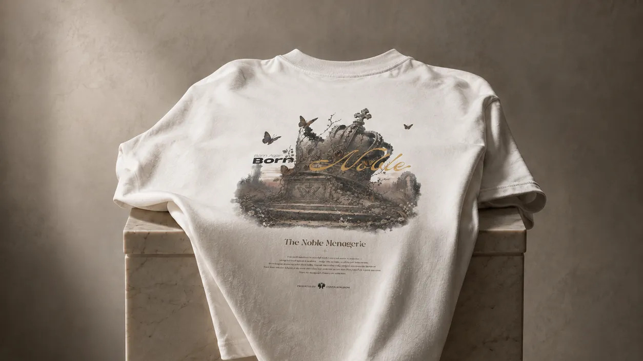
That series is The Noble Menagerie — crowns, birds, butterflies, and specimen plates lifted from European natural-history engravings, collaged into a streetwear print with a “born noble” narrative, so the most everyday garment imaginable — an oversized cotton tee — can carry the weight of classical aesthetics.
The thinking
The decisions behind it
-
Cut the count001
Ten pieces → five. Validate the direction before you flood the shelf. More isn't richer — it's just more scattered.
-
Concept first, then hands002
With the brand concept in hand, we didn’t rush to draw. We locked the core first: Born Noble. Then we chose five images to each carry it — the elegance of the deer, the courage of the lion, the purity of the swan, the belonging of the castle, the rebirth of the crown. Five pieces aren’t five graphics; they’re five faces of one idea.
-
See the picture first003
This step took the most work. A concept isn’t enough — you need a visual language that’s both cool and exact. We studied how a few serious artists handled it, then settled the combination first: copperplate-engraving texture, classical animal portraiture, modern streetwear typography. Only once that picture was fixed did we start making the graphics.
-
The last move is by hand004
What came out was “close enough,” not “that’s the one.” We took it into Photoshop and pushed it, detail by detail, until it was right. That step is the entire distance between “close” and “right.”
The system
Colour and type
Colour palette
- #efe7d6
- #1a1a1a
- #8c6a3d
- #a36945
Typography
- Trajan Prodisplay
- Pinyon Script
- Cormorant Garamondtext
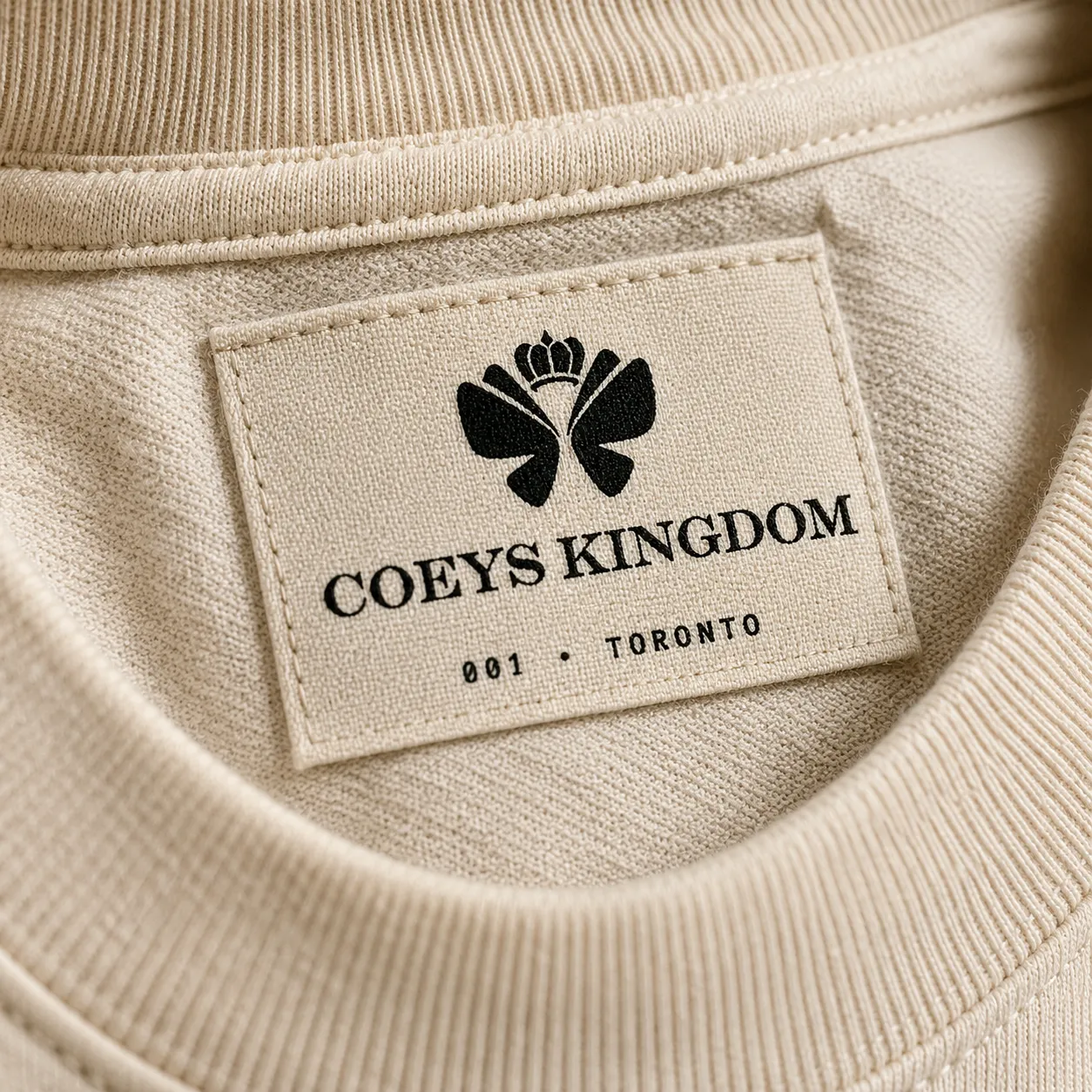
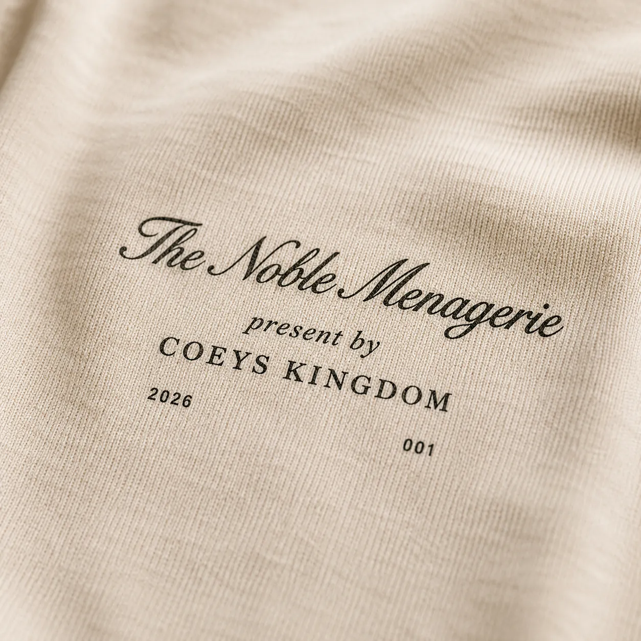
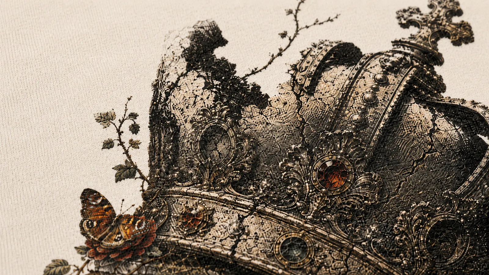
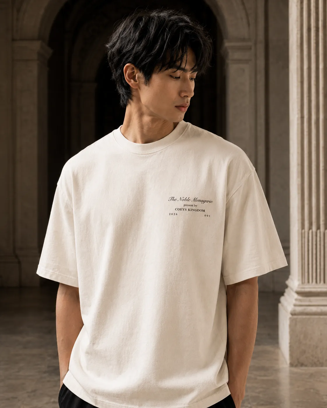
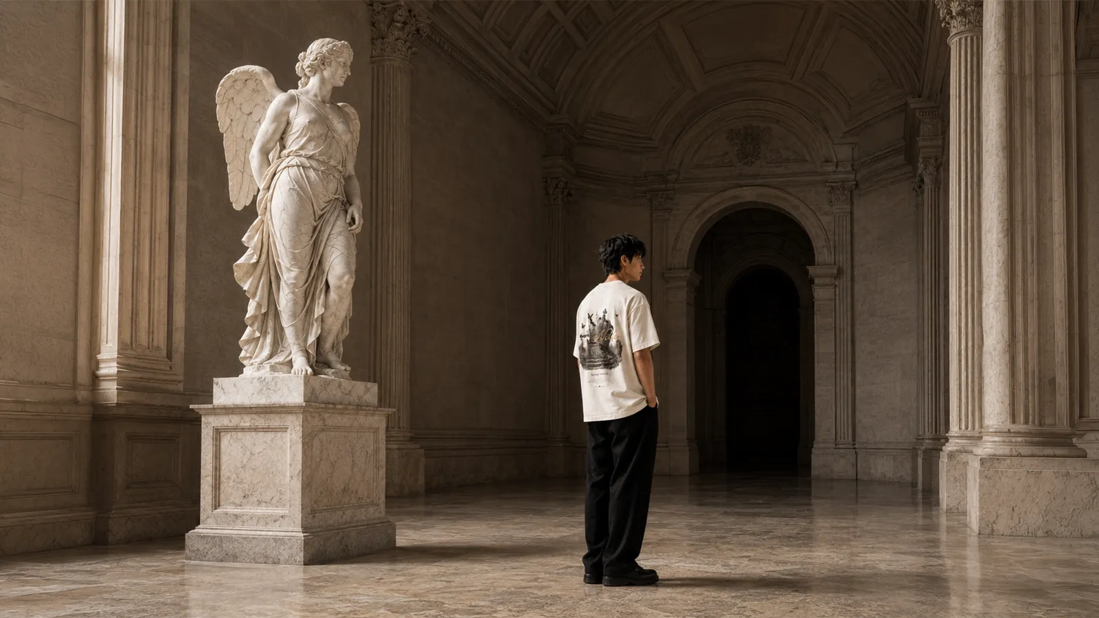
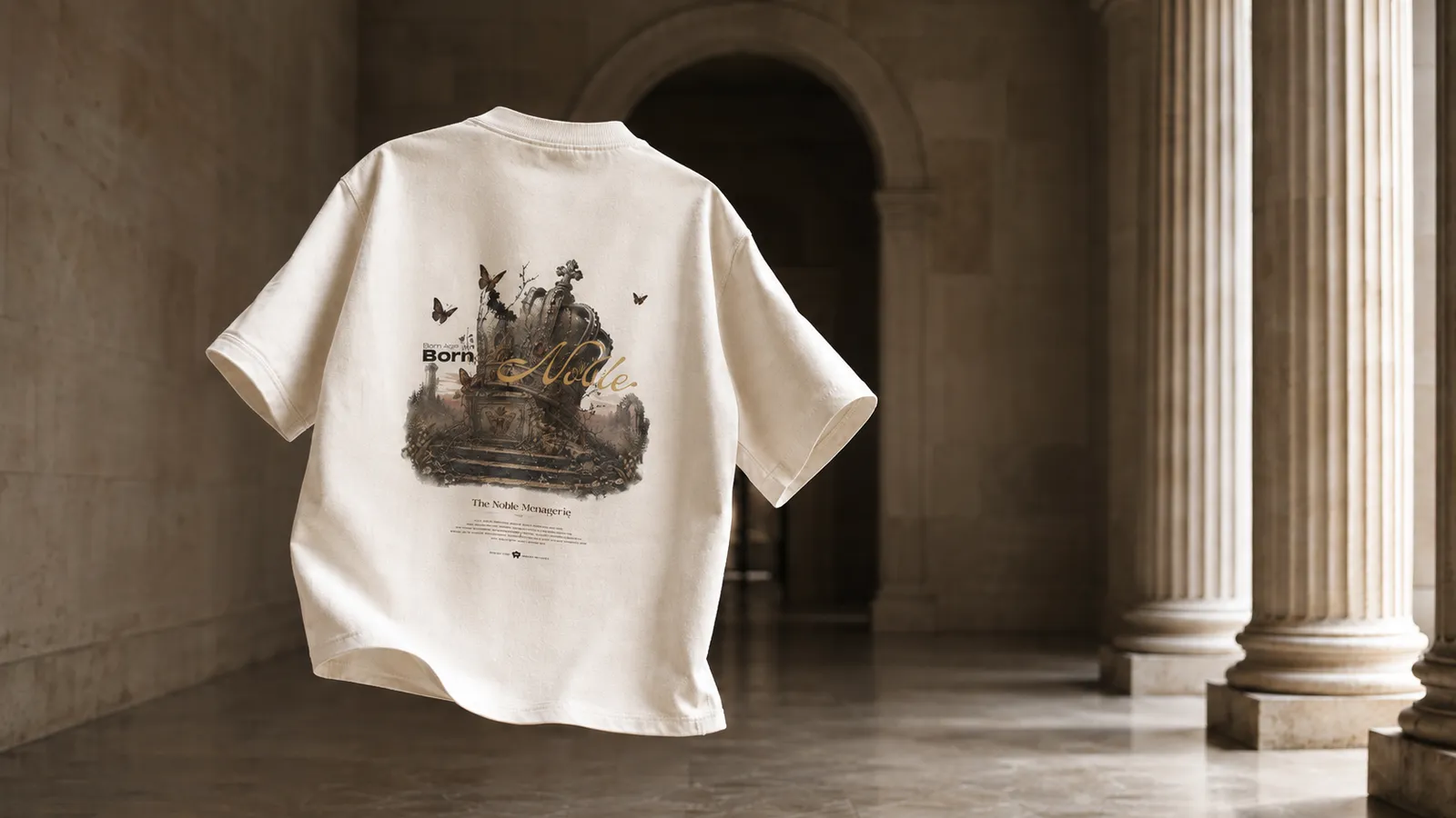
Five pieces aren’t five graphics; they’re five faces of one idea. Lock the tone first — get the direction right and it doesn’t matter how many you add later.
About the images: the five graphics were generated with AI, then finished by hand in Photoshop.