
Websites · Client project
One screen, one subject.
A website for The Unionville condominium — and how it was made to feel high-end
- Kind of work
- Websites
- Project
- Client project
- Scope
- Website design · English and Chinese · Real estate
- Year
- 2024
- Website
- theunionville.ca
The Unionville
The client asked for one thing: high-end. Our answer was to give each screen a single subject.
The Unionville is a pre-construction condominium in the Angus Glen neighbourhood of Markham. Nothing is built yet, so all a buyer can see is renderings and film — and how the website shows them is the first impression the building makes.
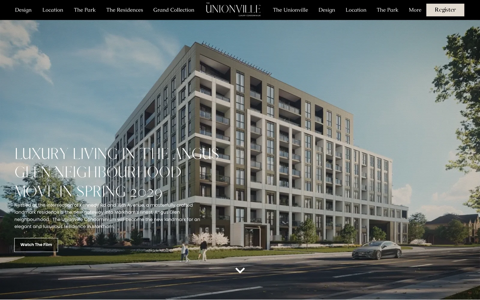
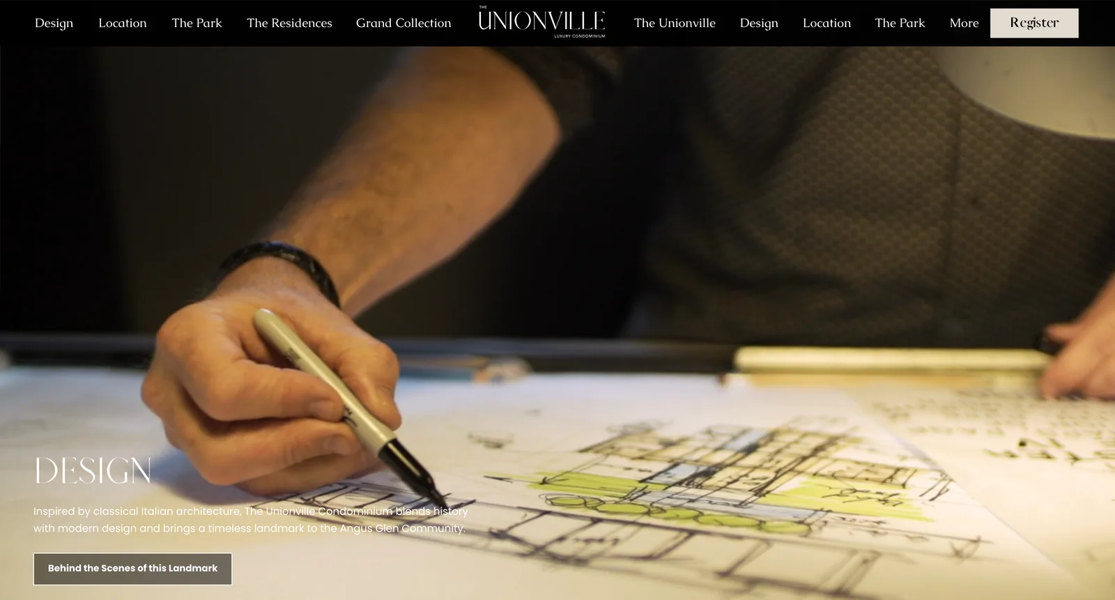
High-end does not come from putting more on the page. It comes from putting less. We split the content up, gave each subject a screen of its own, let the renderings and the film fill it, and moved the words to a corner.
The thinking
The decisions behind it
-
One subject to a screen001
Design, location, the parks, the residences, amenities, education, the building’s technology: seven reasons to buy, each with a screen to itself. A screen has a title, two or three lines and one button; anyone who wants more follows the button to a page of its own. Scrolling down, a visitor has one thing to take in at a time.
-
The picture leads002
Every screen is a rendering or a piece of film from edge to edge, with the words set at the bottom left, not across the middle of the picture. The first screen is the building itself: one rendering, one headline, the move-in date, and a button to watch the film.
-
One action: register003
The whole site asks for one thing. “Register” is the only button that stands out in the menu, and a sign-up window opens on arrival: leave your details, and the floor plans and the price list are sent to you.
-
Two languages, a version each004
The site has a complete English version and a complete Chinese one, with a switch in the menu. Each shows one language only, so no screen carries two sets of words.
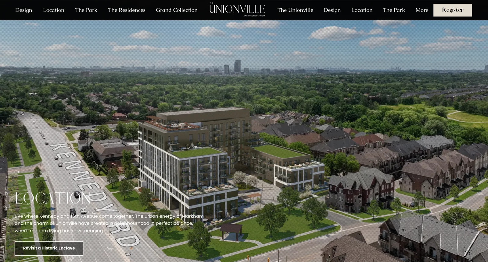
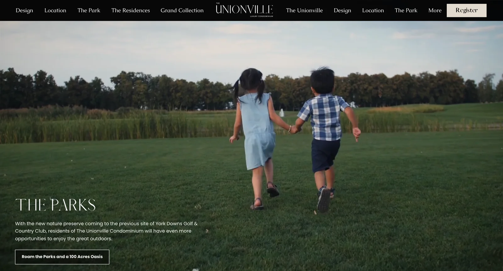
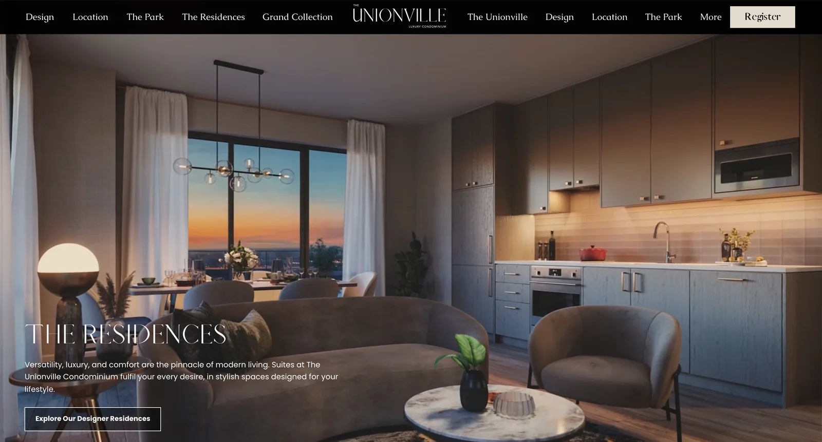
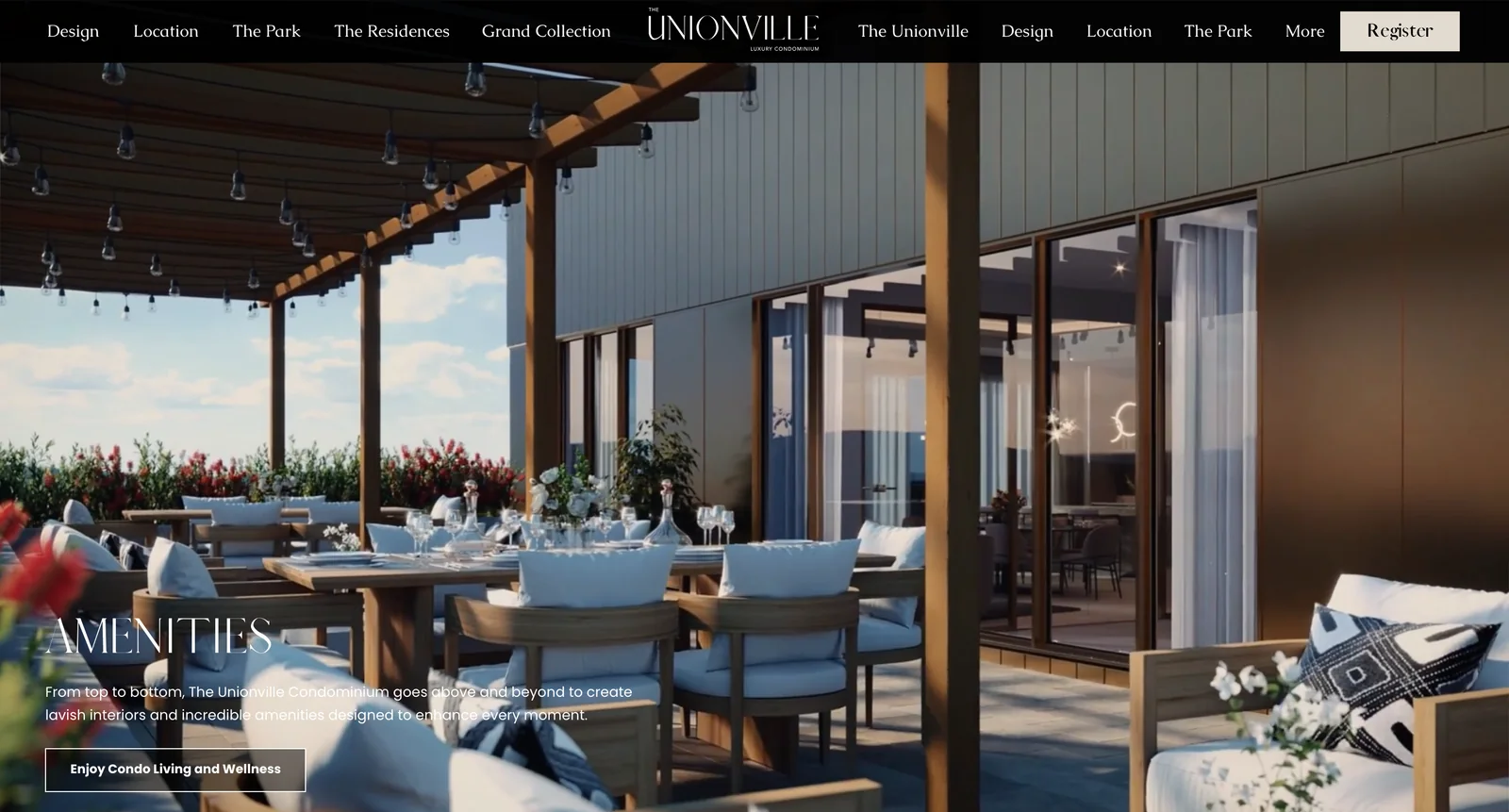
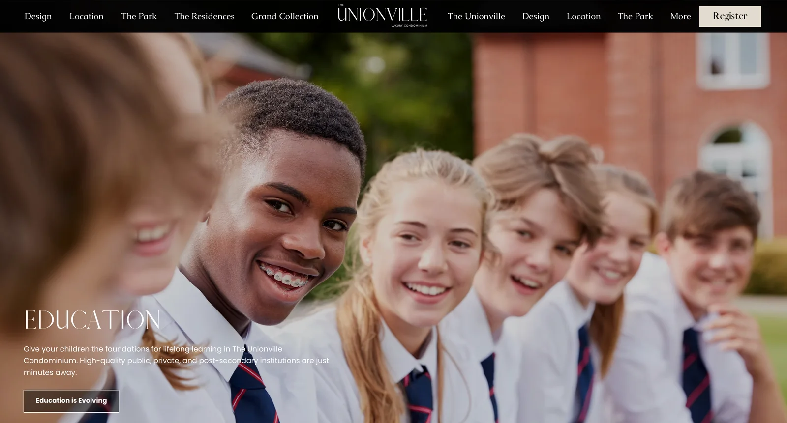
High-end is not more on the page. It is the nerve to put less: one subject to a screen, and the picture has room to carry weight.
About the pictures: the renderings and the film were supplied by the developer. We designed and built the website, its Chinese version and the sign-up window.