Branding · Concept project
Oribe
A menu and print identity system for a modern kaiseki restaurant in Toronto
- Kind of work
- Branding
- Project
- Concept project
- Scope
- Food & beverage · Branding · Print
- Year
- 2026
Oribe
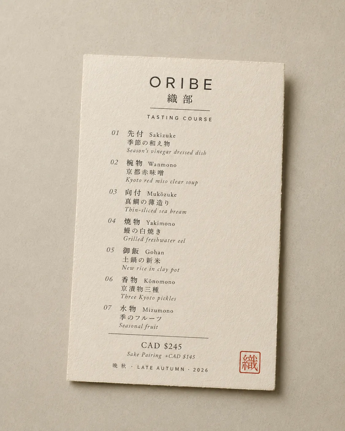
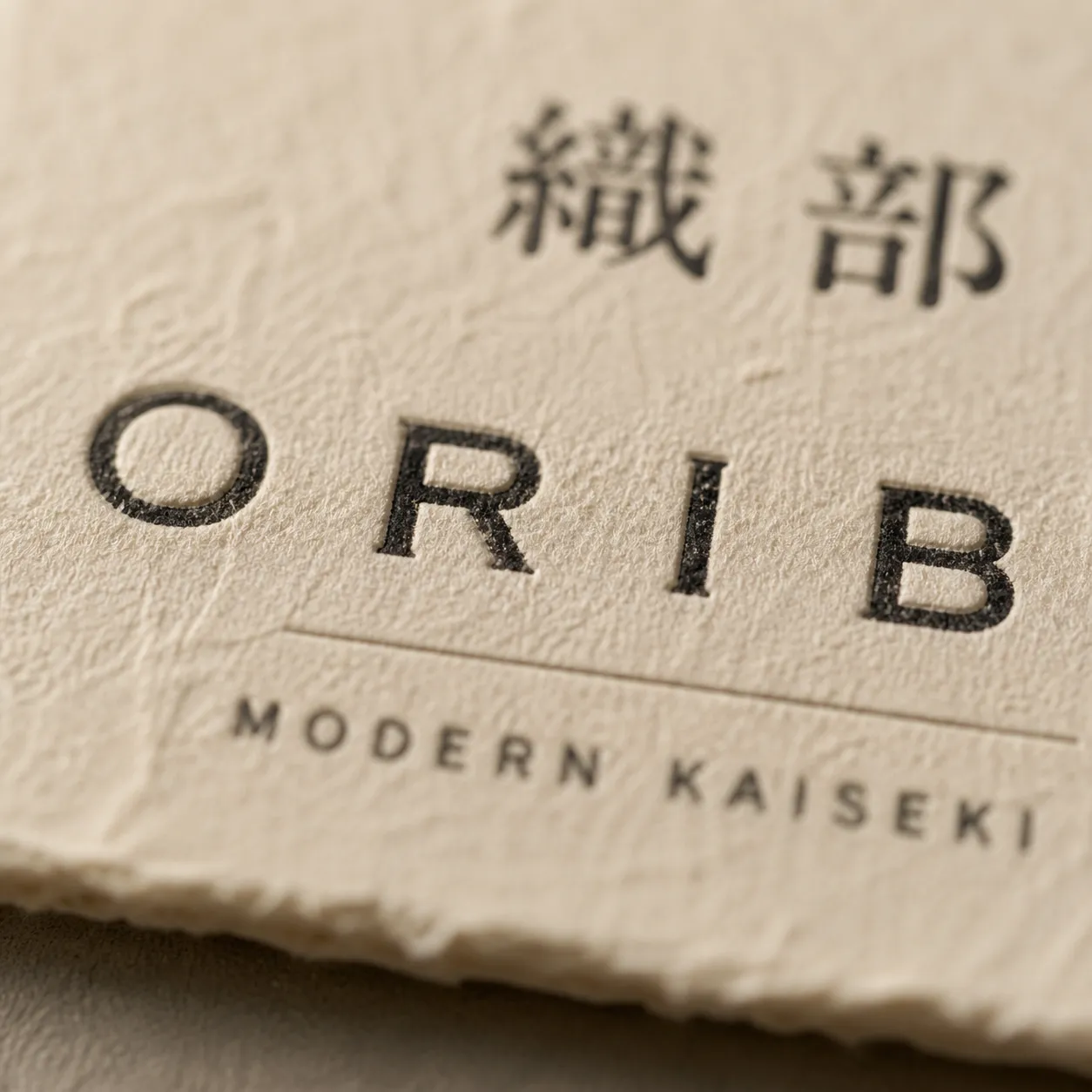
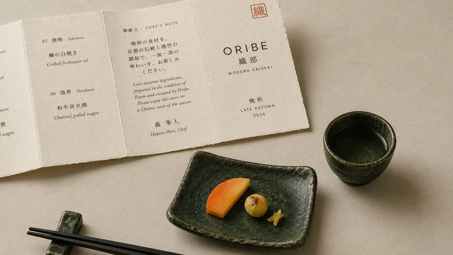
Oribe is a conceptual modern kaiseki restaurant identity for Yorkville, Toronto. “Oribe” references both the Momoyama-era ceramicist Furuta Oribe and the deep-green, deliberately irregular pottery school he inspired — the brand borrows that name to signal a “traditional ingredient / contemporary presentation” duality, expressed across a print system anchored on a seasonal menu suite.
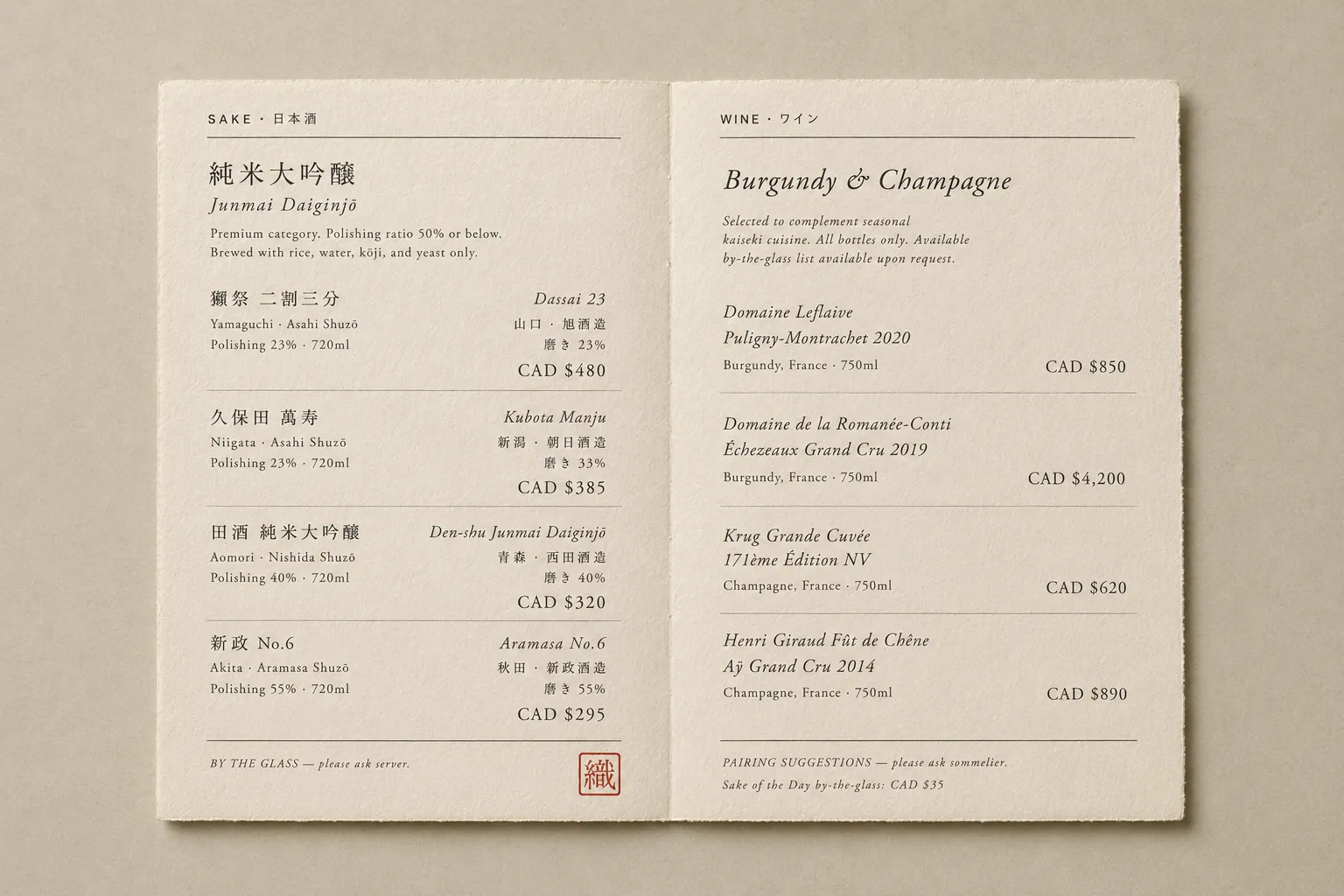
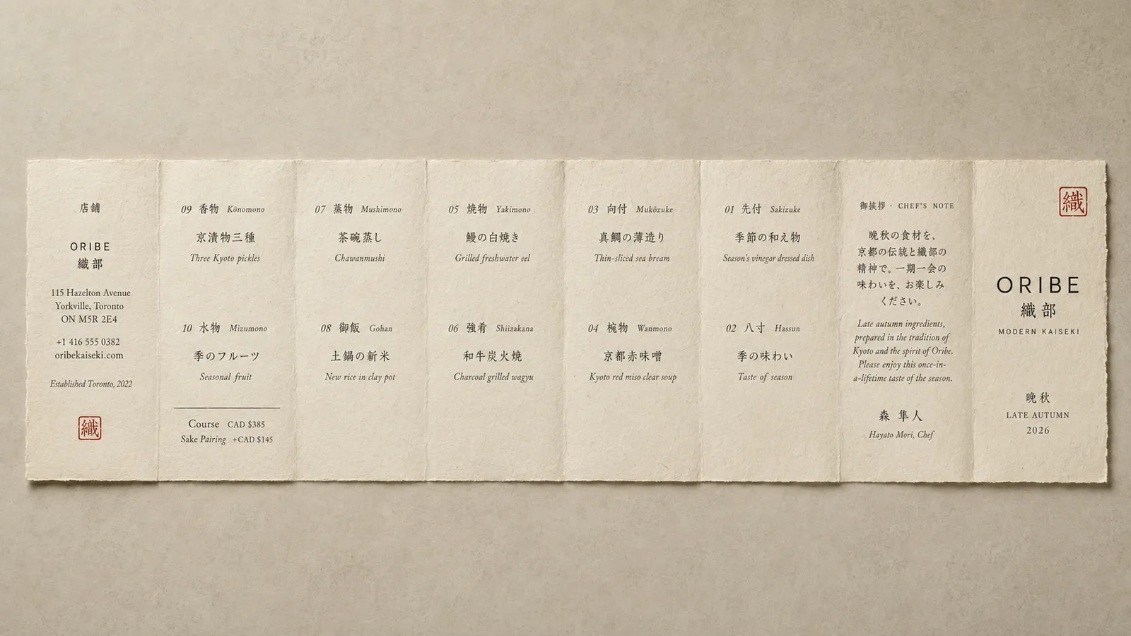
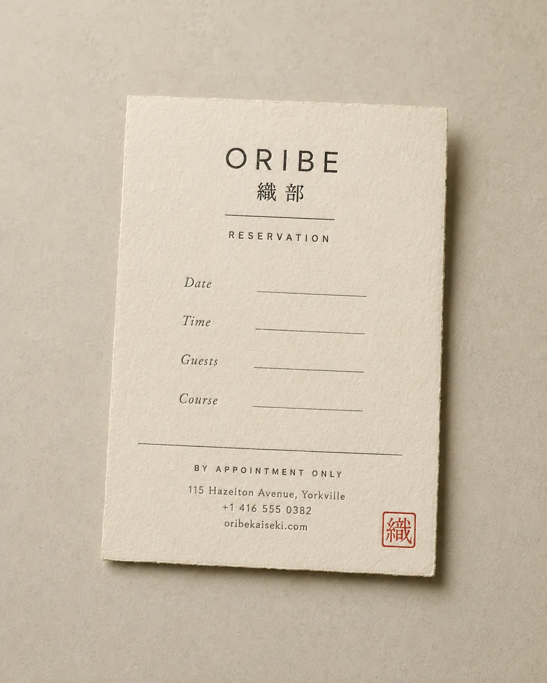
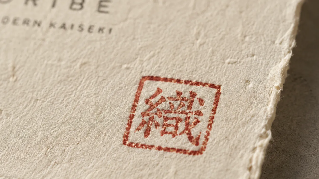
The signature pairs a fine serif ORIBE wordmark with the Chinese characters 織部 and a red square stamp reading 織— a “modern surface, eastern roots” identity. Every printed surface uses cream mulberry/kozo washi with deckle edges and visible texture, making the menu itself a tactile object. The palette is held to four: washi cream as ground, deep charcoal for text, Oribe red for the stamp, Oribe green as a ceramic-derived accent. Menus are tiered by use: the Tasting Course is dense information, the sake list is a side-by-side spread, the fold-out is a full theatrical reveal, and the reservation card is the smallest possible ceremony. The 織 stamp is hand-pressed on every piece — in a digitized fine-dining world, that single mark is the brand's signature.
The system
Colour and type
Colour palette
- #e8dfcc
- #1a1a1a
- #a8513b
- #4a5d4a
Typography
- Trajan Prodisplay
- Source Han Seriftext
- Helvetica Now Texttext